Role

Product Designer

Duration

1 weeks

Industry

Logistic

Focus

Systems design, operational UX, decision-making Interface

Role

Product Designer

Duration

2 weeks

Industry

Logistic

Focus

Systems design, operational UX, decision-making Interface

The Problem (why this matters)

Logistics doesn’t fail loudly, it fails quietly, expensively and by the time customers complain

• An order is already delayed

• Revenue is already gone

• Trust is already damaged


Most logistics teams don’t lack effort, they lack visibility, they operate with:

• Disconnected tools

• Static reports

• Delayed alerts

• And no single source of truth

The result? Teams are always reacting , never ahead.

RouteHQ was designed to change that.

Logistics doesn’t fail loudly, it fails quietly, expensively and by the time customers complain

• An order is already delayed

• Revenue is already gone

• Trust is already damaged


Most logistics teams don’t lack effort, they lack visibility, they operate with:

• Disconnected tools

• Static reports

• Delayed alerts

• And no single source of truth


The Goal

Design a Logistics Command Center that helps operations teams:

• See problems as they form, not after damage is done

• Understand what matters now without digging through data

• Act quickly, confidently, and with context

• Protect revenue before it leaks

This was not a dashboard for “monitoring.” It was a system for decision-making under pressure.
My design philosophy

Before designing screens, I defined one core principle, If the system doesn’t change behavior, it’s just decoration.

Every design decision had to answer:

• What decision does this enable?

• What action does this accelerate?

• What cost does this help avoid?

RouteHQ

Designing a Logistics Command Center That Fixes Problems Before Customers Notice

RouteHQ

Designing a Logistics Command Center That Fixes Problems Before Customers Notice

My design philosophy

Before designing screens, I defined one core principle, If the system doesn’t change behavior, it’s just decoration.

Every design decision had to answer:

• What decision does this enable?

• What action does this accelerate?

• What cost does this help avoid?

Understanding the users

Designed RouteHQ for three real-world personas:

1. Operations Managers

They need:

• Real-time clarity

• Fast escalation paths

• Fewer surprises


2. Dispatch & Support Teams

They need:

• Live order status

• Rider context

• Clear recovery steps


3. Executives & Founders

They need:

• High-level signals

• Revenue visibility

• Confidence that the system is under control

Understanding the users

Designed RouteHQ for three real-world personas:

1. Operations Managers

They need:

• Real-time clarity

• Fast escalation paths

• Fewer surprises


2. Dispatch & Support Teams

They need:

• Live order status

• Rider context

• Clear recovery steps


3. Executives & Founders

They need:

• High-level signals

• Revenue visibility

• Confidence that the system is under control

The core insight

Most logistics tools answer “what happened?”

RouteHQ was designed to answer:

• What is happening now?

• What will break next?

• What should we do about it?

That insight shaped the entire system.

Information architecture (thinking in systems)

Instead of designing isolated screens, I designed layers of awareness:

1. Executive Overview – Signals, not noise

2. Live Monitor – Reality as it unfolds

3. Fleet Performance – Patterns and accountability

4. Incident & Recovery Center – From problem to resolution

5. Revenue & Financials – Operational impact in money

6. System Settings – Control without complexity
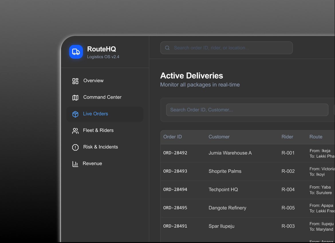
Executive Overview

Turning chaos into clarity, Is the business healthy right now?”

Design decisions:

• Large, readable metrics (no tiny numbers)

• Trends over time, not isolated values

• Clear status indicators (healthy, at risk, critical)

What I intentionally avoided:

• Overloading executives with raw data

• Making them interpret charts

• Requiring clicks to understand risk

This screen is about confidence, not curiosity

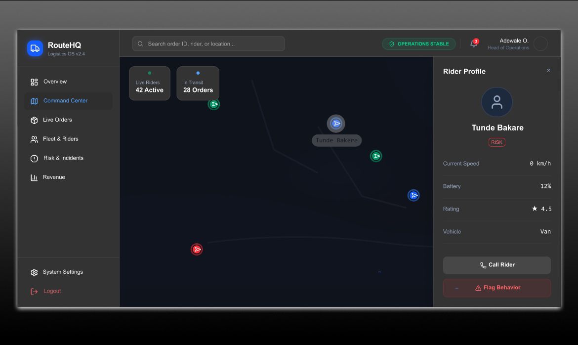
Live Monitor

Seeing operations as they happen, Logistics is spatial so RouteHQ makes location unavoidable.

Design decisions:

This screen shows:

• Active riders in real time

• Live delivery status

• At-risk orders highlighted early


UX choices:

• Color used only for meaning (not decoration)

• Motion implies activity, not distraction

• Status changes are immediate and visible

The goal wasn’t beauty, it was situational awareness.

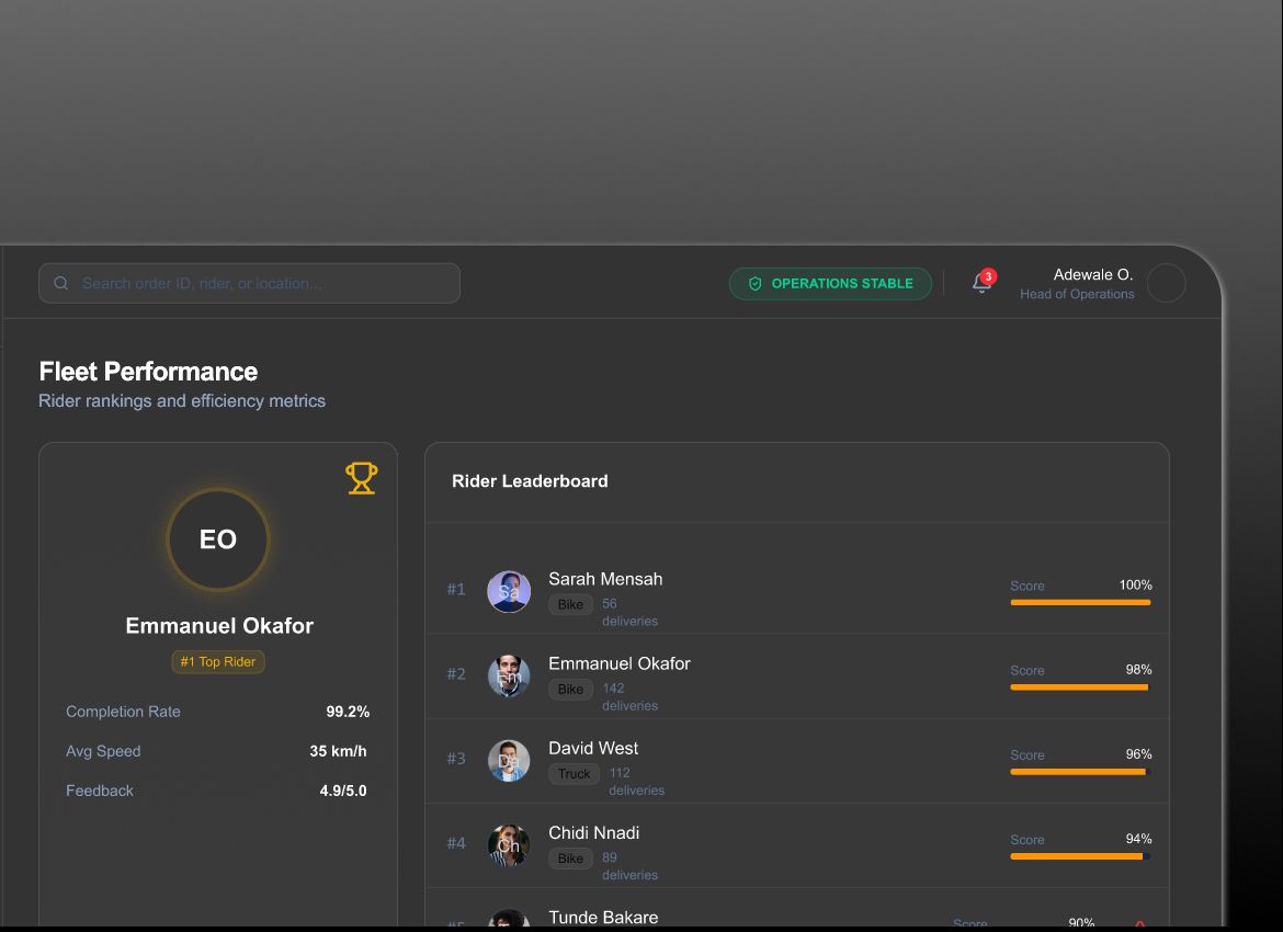
Fleet Performance

Accountability without blame

Instead of ranking riders to shame them, I focused on:

• Patterns

• Trends

• Performance signals

This helps teams:

• Spot struggling routes

• Support riders early

• Improve systems, not punish individuals

Good UX doesn’t create fear — it creates clarity.

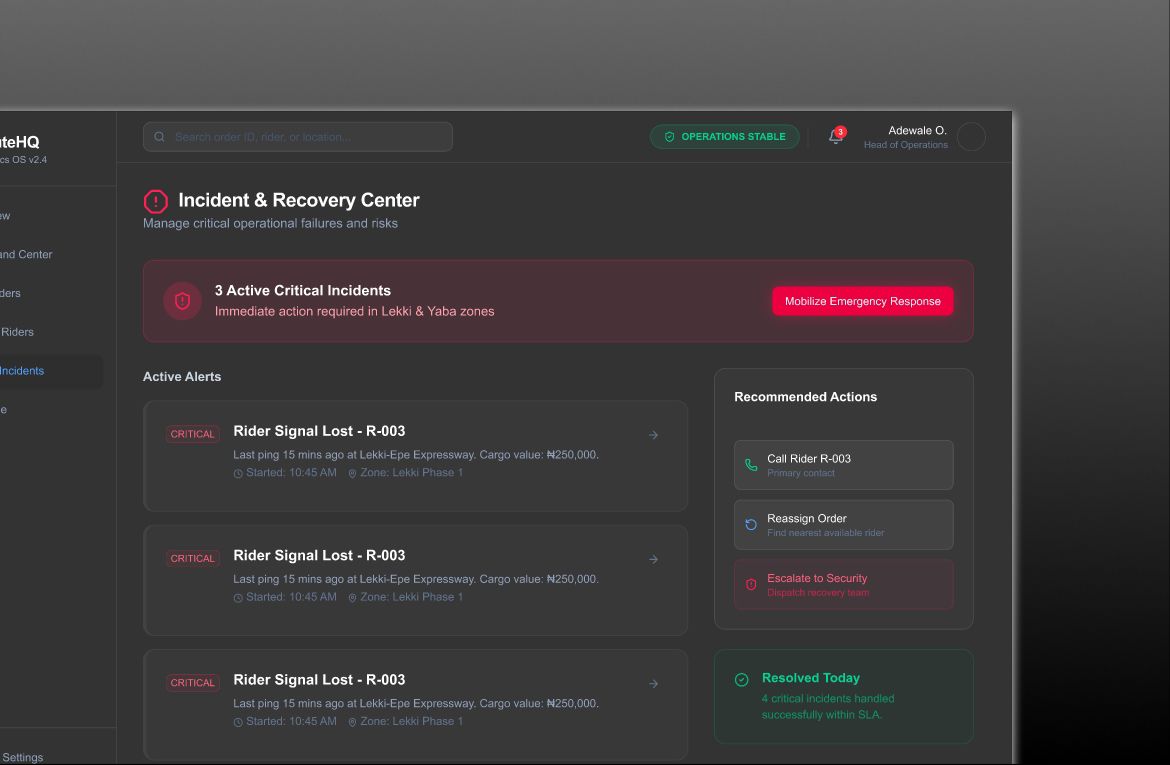
Incident & Recovery Center

Where problems meet solutions, this is the heart of RouteHQ.

Every incident shows:

• What happened

• Why it matters

• What action to take next

Design choices:

• Clear severity levels

• Recommended actions, not just alerts

• Resolution tracking to close the loop

This turns the system from a “warning board” into a problem-solving engine.
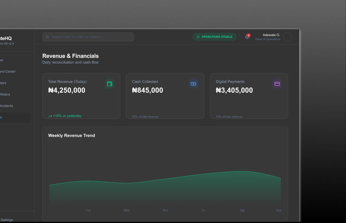
Revenue & Financials

Making operations visible in money, most ops tools hide financial impact.

RouteHQ does the opposite.

Here, teams can see:

• Revenue at risk

• Daily and weekly trends

• How operations affect cash flow

This connects:

Delivery delays → Customer trust → Revenue loss

When teams see the cost, urgency becomes natural.
Visual design decisions

Color

• Dark UI to reduce eye strain in long sessions

• Red reserved strictly for risk

• Green for confirmed success

• Neutral tones for background clarity

Color was treated as language, not style.

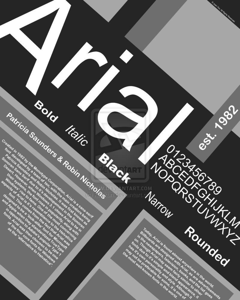
Typography

• Clean, highly readable type

• Clear hierarchy between signal and detail

• Designed for scanning, not reading essays

Typography here is about speed, not personality.
Why this design work

RouteHQ succeeds because it:

• Surfaces problems early

• Reduces cognitive load

• Aligns teams around the same truth

• Turns data into action


It doesn’t just look professional.

It changes how teams operate.

Impact (intended outcomes)

Impact (intended outcomes)

• Fewer missed deliveries

• Faster incident resolution

• Reduced revenue leakage

• Happier customers

• More confident teams

This is what good system design looks like.

Why this design work

RouteHQ succeeds because it:

• Surfaces problems early

• Reduces cognitive load

• Aligns teams around the same truth

• Turns data into action


It doesn’t just look professional.

It changes how teams operate.

Impact (intended outcomes)

Impact (intended outcomes)

• Fewer missed deliveries

• Faster incident resolution

• Reduced revenue leakage

• Happier customers

• More confident teams

This is what good system design looks like.

What this project says about me

This project demonstrates that I:

• Design for real business problems

• Think in systems, not screens

• Understand operations, finance, and human behavior

• Design clarity, not clutter

I don’t just make interfaces look good, I make complex businesses work better.

Final thought

Good design isn’t about visuals, It’s about giving people control over chaos.

RouteHQ is proof of that.

Final thought

Good design isn’t about visuals, It’s about giving people control over chaos.

RouteHQ is proof of that.

Let’s build something users trust

I’m open to freelance, contract, and full-time opportunities. If you’re building a product and need clear UX, strong UI, and thoughtful user flows, let’s talk.

Let’s build something users trust

I’m open to freelance, contract, and full-time opportunities. If you’re building a product and need clear UX, strong UI, and thoughtful user flows, let’s talk.

Let’s build something users trust

I’m open to freelance, contract, and full-time opportunities. If you’re building a product and need clear UX, strong UI, and thoughtful user flows, let’s talk.

Back

Back

Create a free website with Framer, the website builder loved by startups, designers and agencies.