Ayomama
Designing Everyday Maternal Care Where Hospitals Are Not Always Within Reach
Role
Product Designer
Industry
Healtech / Femtech
Outcome
The design help the team raised non-equity funding

About the Project
Ayomama is a digital maternal care platform built to support women through pregnancy and postpartum, especially in places where access to consistent hospital care is limited.
This was not a project about features. It was about responsibility.
Pregnancy is not a software problem. It is a life stage filled with uncertainty, fear, hope, and constant decision-making. Most complications do not begin in hospitals. They begin at home, quietly.
Ayomama was designed to live in that quiet space between clinic visits, not to replace doctors, not to diagnose but to support daily understanding.
The Problem
The deeper problem was not lack of information, there is too much information.
The real problem was this:
Women did not know what mattered today.
• Is this pain normal?
• Should I wait?
• Is this urgent?
• Am I overreacting?
Most maternal apps focus on tracking or content.
Hospitals focus on appointments, but the daily moments, the small doubts, were unsupported.
When uncertainty meets silence, risk increases. And in maternal health, delay can cost lives


The Challenge
The challenge was designing something that:
• Supports women daily without creating panic
• Uses AI without replacing medical authority
• Works even when hospital access is inconsistent
• Feels calming without hiding serious issues
• Is simple enough for low digital literacy users
I wasn't designing for convenience, we was designing trust. Trust is fragile in healthcare, one misleading answer can break it.
My Approach
Start With Restraint
Before designing screens, I defined boundaries.
• AI will not diagnose.
• The system will not pretend to be a doctor.
• Every serious concern must escalate to a human.
This decision shaped everything.
Design Around the Daily Decision
I mapped where risk truly begins, not during appointments, not during onboarding but during ordinary days at home.
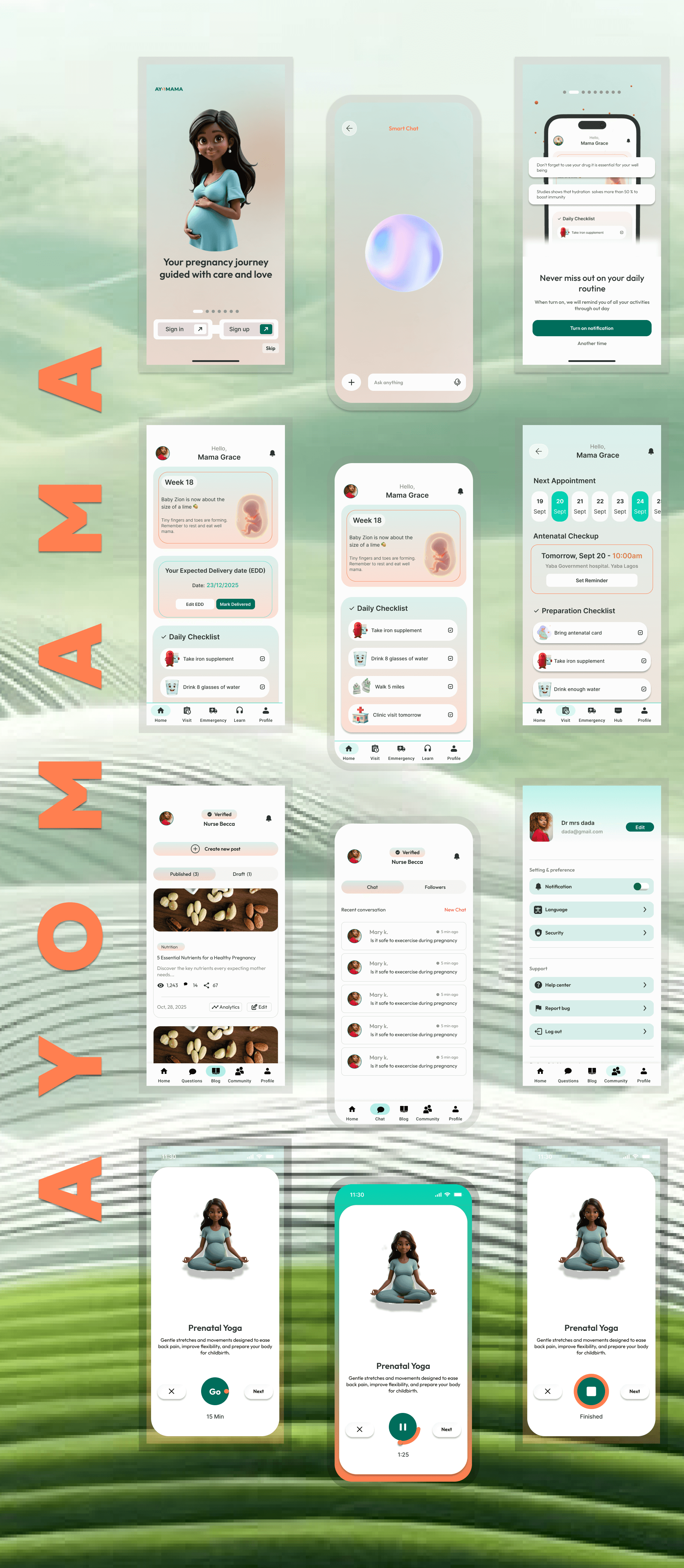
So I made one screen the center of the experience: The Dashboard.
It answers three questions clearly:
• Where am I in my pregnancy?
• What should I do today?
• Is anything concerning?
If those are clear, fear reduces and if those are unclear, everything fails.
Make Education Contextual, Not Overwhelming
I removed searchable content overload.
Instead, guidance appears based on:
• Pregnancy week
• Logged symptoms
• Upcoming milestones
The system does not say “Here is everything” It says “Here is what matters now” that shift changed engagement entirely.
Design AI as an Assistant, Not an Authority
When users ask questions:
AI:
• Observes patterns
• Asks follow-up questions
• Surfaces possible concerns
But when a question crosses into diagnosis, it clearly says: “This needs a doctor.”
I tested this behavior with clinicians, they appreciated it not because it was impressive, but because it was responsible.

Key Screen Designed
Notification Screeh

A simple UX decision that helped secure funding for Ayomama.
I added notification setup during onboarding and I was challenged on it:
Why introduce notifications so early?
Simple answer:
In healthtech, missed alerts are dangerous.
If a patient on medication misses a reminder, outcomes are affected.
Most users never go back to turn
notifications on after signup.
So I made the decision early, with context, purpose, and clarity.
Small change, Real impact.
Emergency screen

Why I Chose 3 Taps Over 1 to Save Lives
The developers argued: “It’s an emergency shouldn’t it be just one tap?”
And honestly, that made sense. In an emergency, speed matters.
But here’s where design thinking kicked in.
With just one tap, imagine how many times the Emergency could be triggered by accident a phone in a pocket, a curious child, or even a shaky hand. Each false alert could make people take the next real one less seriously.
So, I designed it differently:
1. 3 intentional taps to confirm urgency.
2. Vibration feedback after each tap, so it feels responsive and reassuring.
This small detail means fewer false alarms and when the real emergency comes, people respond fast and seriously
Language Screen

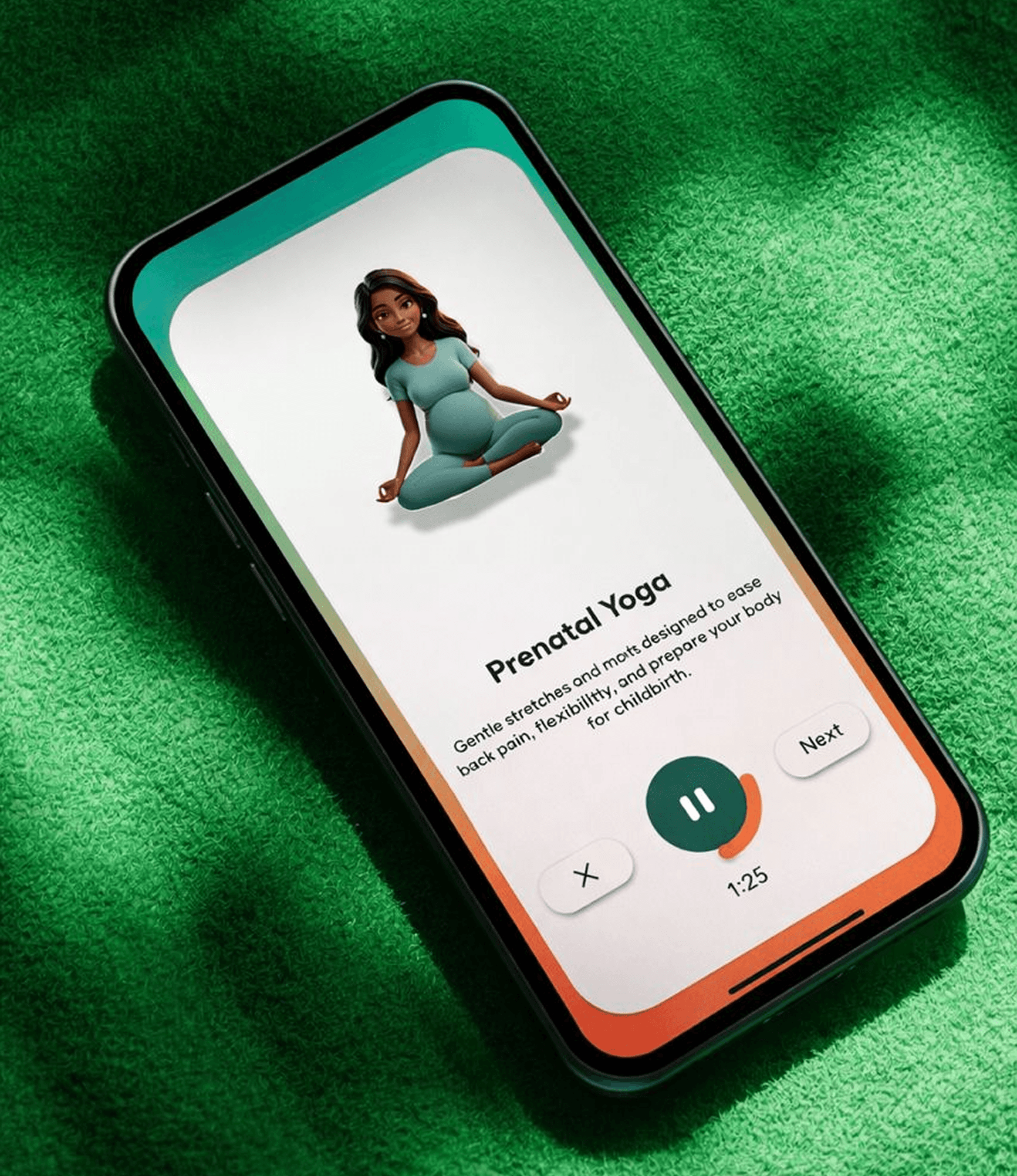
Ayomama was built to support women across different regions and literacy levels. The language is clear and straightforward, avoiding medical jargon, and users can choose the language they’re most comfortable with so the experience feels familiar and easy to navigate.
Visual Identity and Brand Story

Ayomama’s visual language is warm, grounded, and human.
Soft earth tones and muted orange reflect strength and care not fragility. The brand voice avoids medical intimidation, It speaks like a trusted guide, not a textbook.
Ayomama means “Happy Mother.”
Everything in the brand reinforces that mission:
• Simplicity
• Reassurance
• Respect
It does not dramatize pregnancy, It supports it.
Typography as Safety
Typography was treated as a health tool, Large, readable numbers for weeks and due dates, Clear hierarchy, no decorative noise, when someone is anxious, they should not struggle to read.
Clarity is calm.
Animations

Animation was used carefully and intentionally.
• Subtle transitions to guide attention
• Gentle motion when milestones are reached
• Soft feedback when tasks are completed
No flashy movements, in maternal care, the interface should feel steady and movement should reassure, not distract.
The goal was emotional safety, not delight for its own sake.
Screens
Data Privacy & Compliance
Ayomama was designed with privacy as a foundation, not an afterthought.
Maternal health data is deeply personal. From pregnancy stage to symptom logs and doctor conversations, every interaction involves sensitive information. Because of this, the product was structured to align with global data protection standards such as GDPR (Europe), HIPAA (United States), and NDPR (Nigeria) where applicable.
User consent is clear and transparent. Data collection is limited to what is necessary. Users can access, review, and request deletion of their data at any time.
Trust in healthcare is not only about medical accuracy, it is also about protecting personal information. Ayomama was built with both in mind.
Results & Outcomes
• Women reported feeling more confident between hospital visits
• Doctors expressed trust in the AI boundaries and escalation system
• Daily engagement centered around the dashboard became the core habit
• Users understood what mattered without needing to search
More importantly:
The product proved that maternal health technology does not need to be louder or smarter, it needs to be clearer.
It showed that AI in healthcare earns trust not by knowing more but by knowing when to step back.
Back